The European Humanist Forum 2018 will take place in Madrid on the 11th, 12th and 13th of May and is an initiative incredibly organised 100% by volunteers who not only have the difficulties of daily life to resolve before applying themselves to the task of making the forum happen, they then have to resolve the difficulties of trying to communicate among themselves even though they all speak different languages!
Many hundreds of hours of work have been invested so far in getting the forum to this stage and with 3 and a half months to go all the pieces of the jigsaw puzzle are starting to fit together. The most impressive externally visible part so far is the website running in 7 languages, but a lot of things are in motion behind the scenes.
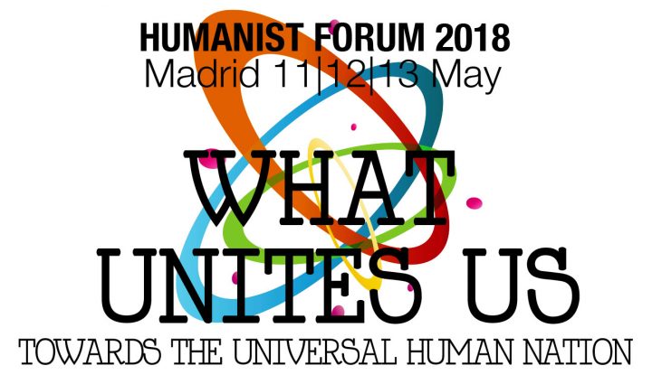
Friends from 13 different countries are involved in the organisation of the forum and one of the first things to resolve back in 2017 was the logo.
Graphic designers from across the continent were asked to submit designs and ideas for the logo and after a round of voting the proposals by Greek graphic designer, Evita Paraskevopoulou, were chosen as the basis for the final design.
The logo is a set of coloured circular rings and solid smaller circles, inter-crossing, overlapping and oriented in different directions. It gives a sense of movement, of diversity, and also of joy.
We interviewed Evita for the website to ask her about the design process.
EHF2018: Evita, what does the logo represent for you? What is its meaning?
Evita Paraskevolpoulou: You can see that the logo orbits around an invisible centre. Orbits are a symbol that are out of humanity’s earthly substance, like our souls. The invisible centre alludes to that Sacred something that lives within each one of us.
EHF2018: When you were designing it, did the different elements of the logo such as the colours and shapes represent something for you?
EP: Yes, the different colours I chose represent solidarity, hope, peace, tolerance and creativity. They stand brightly for our future happiness and the shading gives them a dynamic nature.
EHF2018: What inspired you when designing the logo?
EP: Actually, the phrase from the slogan “what unites us” was the key for my inspiration, because we are all different but we share a common deeper identity.


