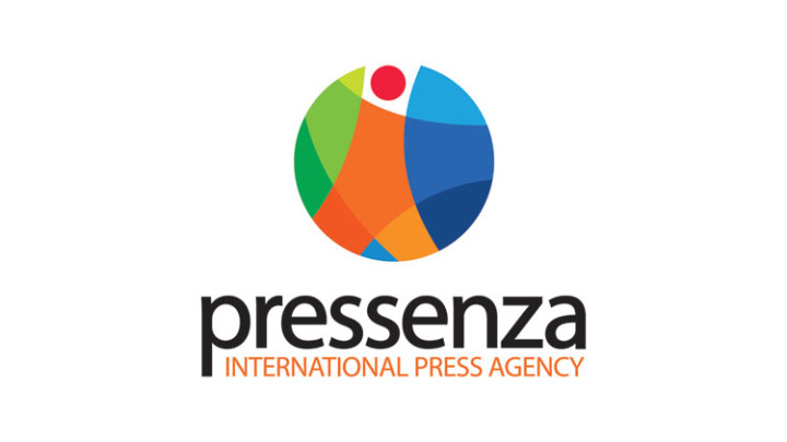
This is the basic premise that has motivated the idea and subsequent preparation of Pressenza’s new image. The logo of an anthropomorphic figure made up of different shapes and colours, synthesises the concept of the diversity of human beings. From this perspective there is a sense of universality and permanence through the avoidance of forms connected to particular places or times. Together with the name of the agency the image becomes a central piece of Pressenza’s new identity.
“The diversity of voices. The diversity of regards. The diversity of realities that ultimately makes human beings. A human being that, on opening itself up, searches for and builds a future. A human being that is unity and also the sum of all the parts. A circular jigsaw puzzle. At the end of the day, a game,” in the words of Jerónimo Villareal, from Manthra Comunicación Integral, Quito, Ecuador, the designer of the image that will from now identify Pressenza, International Press Agency for Peace and Nonviolence, an organisation legally registered in Ecuador with an international scope.
This change of image synthesises, reflects and launches us towards the future. It is, in fact, a moment of history for us.
It is the synthesis of a few years of joint search, of joyful experimentation (at the end of the day, a game), trying to find our own identity and our contribution to the humanisation of the Earth. A humble contribution to a greater purpose and with meaning. It reflects our own diversity as a team of volunteers, each one doing what they know, contributing the best of themselves and their talents; it also reflects our aspiration for diversity as a news agency that wants to report on human, social and cultural diversity in which we build, believe and rejoice. And it launches us towards the future. It allows us to make a pause, an instant in order to look backwards, to value our achievements, to reflect, to turn our look towards the infinite and leap, with the certainty of doing what we want to do.


